Vrbo
Year
Role
Discipline
Credits
2019
Creative Director / Brand Design Lead
Brand Identity · Design System · Art Direction
Neil Petty
Simon Walker
Sean Bueche
Danny Parker
Anjli Mehta
Stephanie Lenk
Jeff Williams
Colin Grigson
---
Design Studio - FÖDA
Background
In 1995, VRBO changed the way we vacation. It was the first online platform to enable vacation rentals, allowing users to browse and book properties that were managed by individual owners. It was a ground-breaking tool that saved money, allowed for flexibility, and launched a new market connecting homeowners with travelers looking for a place to stay on vacation.
VRBO has struggled for years to define itself in this market it created. It was a catalyst for change in the vacation industry, but never developed past it's function. Lack of brand presence lead to unencumbered growth in the competition, and eventually irrelavance. It was acquired first by HomeAway, and then by Expedia, eventually becoming one of hundreds of sub-brands under that umbrella.
The Challenge
In the spring of 2019, Expedia chose to make VRBO the face of their vacation rental inventory, folding in all other sub-brands including HomeAway. It was a second chance for the VRBO brand, and an enormous opportunity to leverage it's historical brand equity to take back the crown as leader of the vacation space. Our goal was to define, and re-establish VRBO's brand in an industry it created, but where the competition was becoming the generic trademark.
The Execution
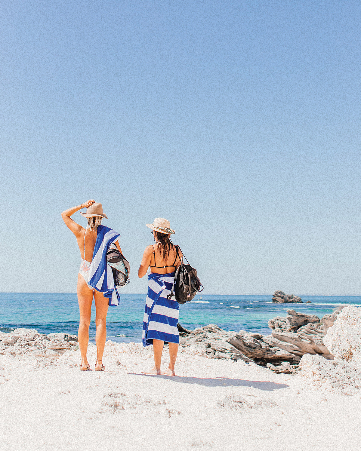
Over the course of a year, we immersed ourselves in consumer research, from massive quantitative surveys to crafting sessions using play-doh and legos in search of why we vacation. What we found is 'ideal vacations' are immensely diverse, and just as much about relaxation as they are about adventure. The throughline though is every single person is looking for a reset; how can I disconnect from the struggle or monotony of my every day to just enjoy life and get back to baseline. Disconnect to reconnect.
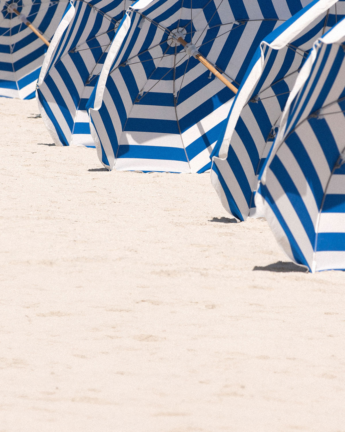
We looked to the sterotypical beach vacation for motifs that draw on the idea of reconnection through disconnection, and discovered towels. Striped towels to be precise. Nothing screams vacation like those blue and white striped towels, and the parellel lines could easily represent the disconnection we feel day to today. During the exploration phase of our wordmark, we found the lovely striped font Dala Prisma by Commercial Type, and created a customized version of the Fat Italic weight. The resulting mark uses the negative space between the stripes to "fill" the letterforms and converging stripes to represent vacation's role in pulling us back together.
Our color palette was also pulled directly from stereotypical beach vacation imagery. The blues and off-whites of the classic french breton striped towels, or a breaking wave on the beach. The tertiary colors pulled from the oranges in sunsets, and greens in lush wilderness surrounding some beaches.
The Process
The first thing I should note about working with Vrbo is they are a data-driven organization, and leave nothing up to chance. This resulting brand needed to be vetted by the entire company and as much of the userbase as possible before launching. This lead to a long, but genuinely one of a kind process involving many cross-functional teams. I led a design process that spanned two design teams, three freelancers, one external design studio, and over 30 internal designers. We immersed ourselves for close to a year in consumer reasearch, and even used facial recognition and eye tracking software once we had five full-fleshed out brand identities to track subliminal reactions to our new brand options.


PREV
NEXT