Ground News
Year
Role
Discipline
Credits
2021-2023
Brand Design Lead
Brand Identity · Design System · Art Direction
Background
Since their founding in 2017, Ground News has worked to combat misinformation and political echochambers by threading multiple perspectives from thousands of publications through one, reliable information platform. With the right tools and guidance, their hope is to break the world from their political bubbles and begin thinking for themselves.
The Challenge
Reimagine the visual identity and digital experience for a first-of-its-kind news comparison platform. This new brand should reflect Ground's mission to well-inform the world through critical thought, and weather the look-a-like and tangential competition in the digital news space.
The Execution
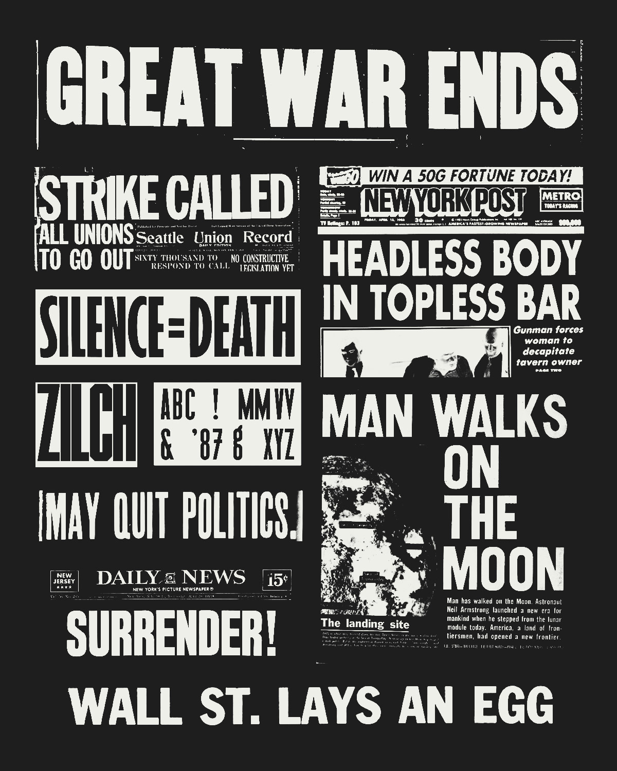
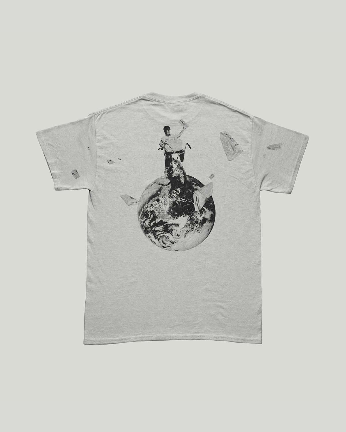
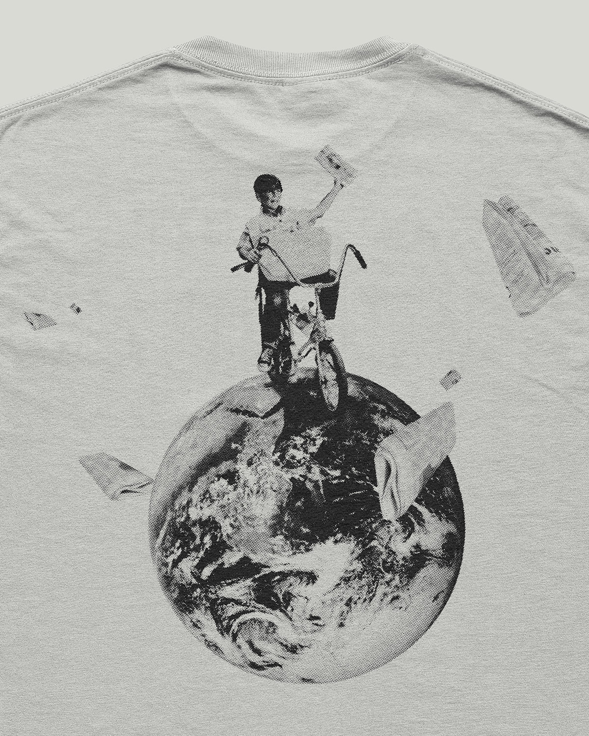
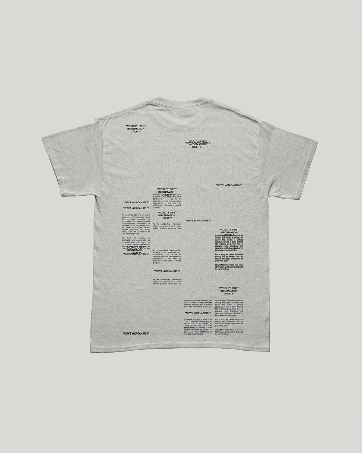
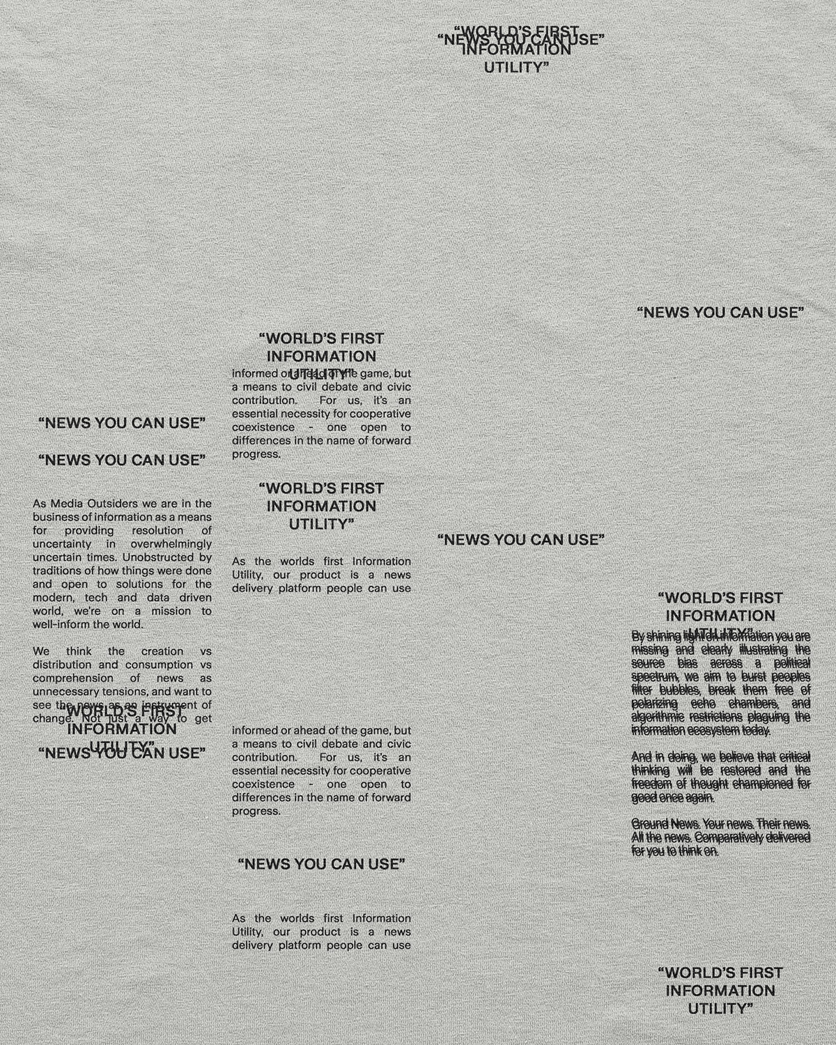
Exploration for the new brand began in news' past, or more specifically in the design language, motifs, and techniques used in the news printing process: bold, condensed typography of sensationalist headlines, the flexible structure a chase provides movable type, the simple palette and halftone treatment of photography in a one color printing process. All were staples of news' past, yet unique to a now digital news space. So we brought them to modern times.
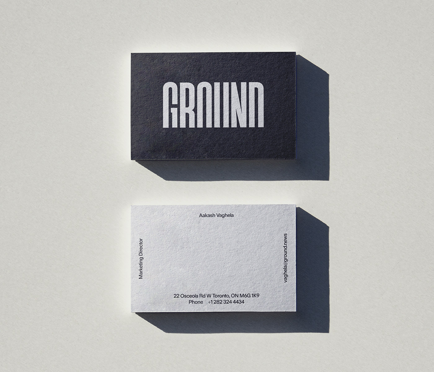
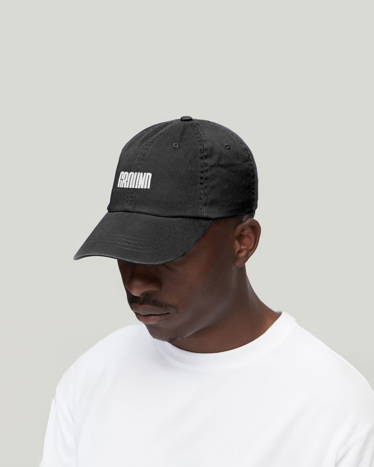
The Logo
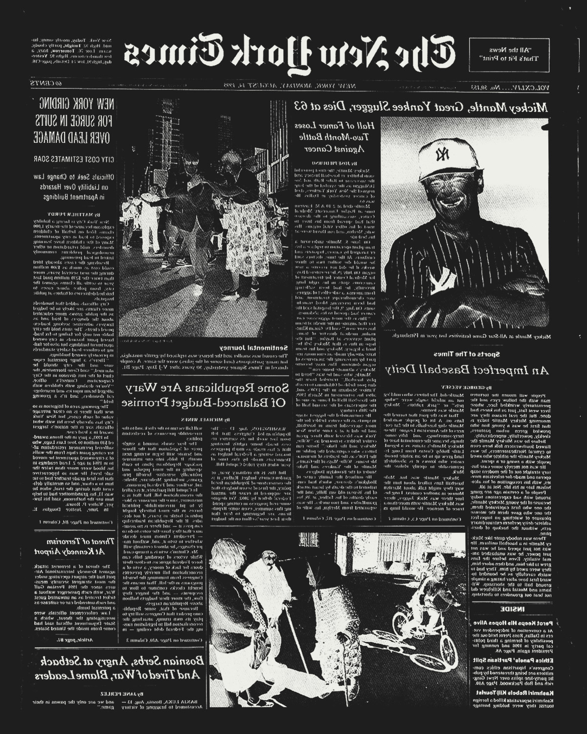
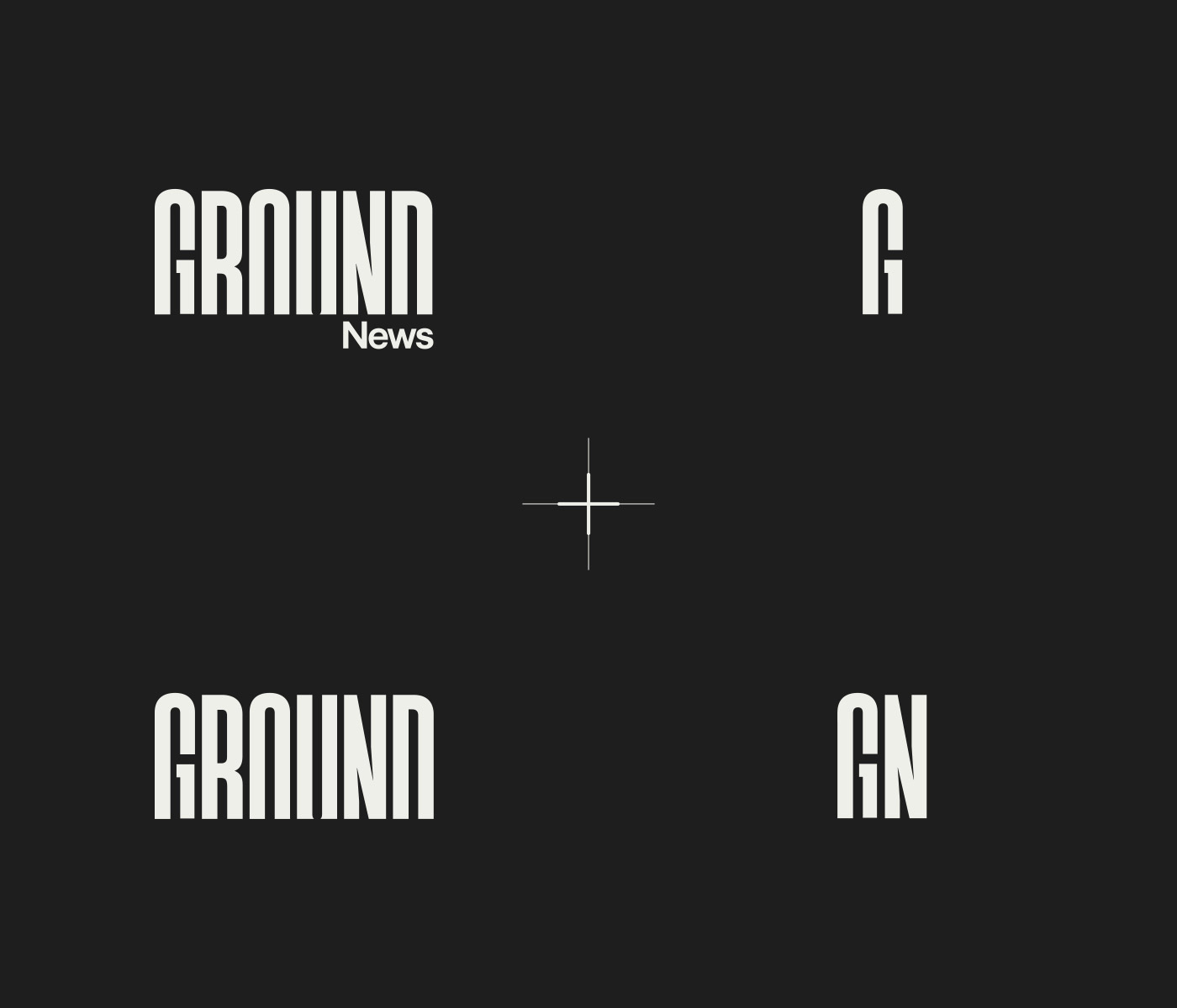
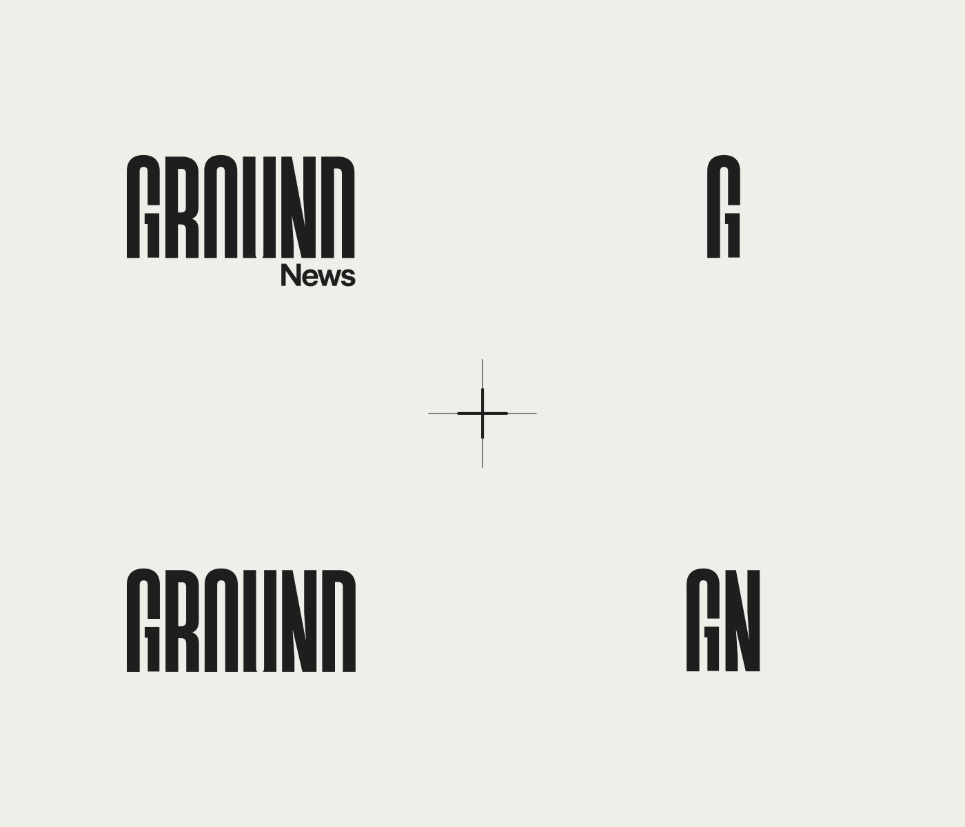
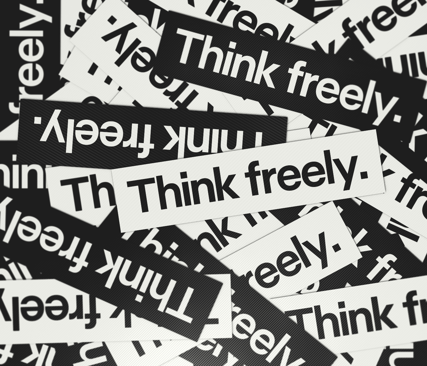
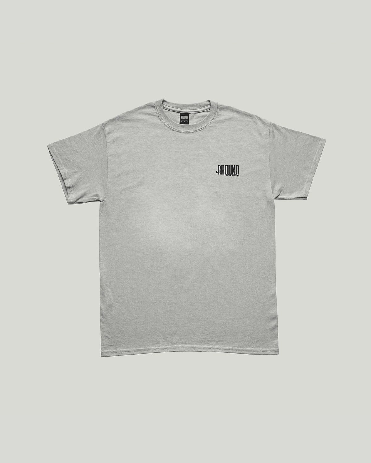
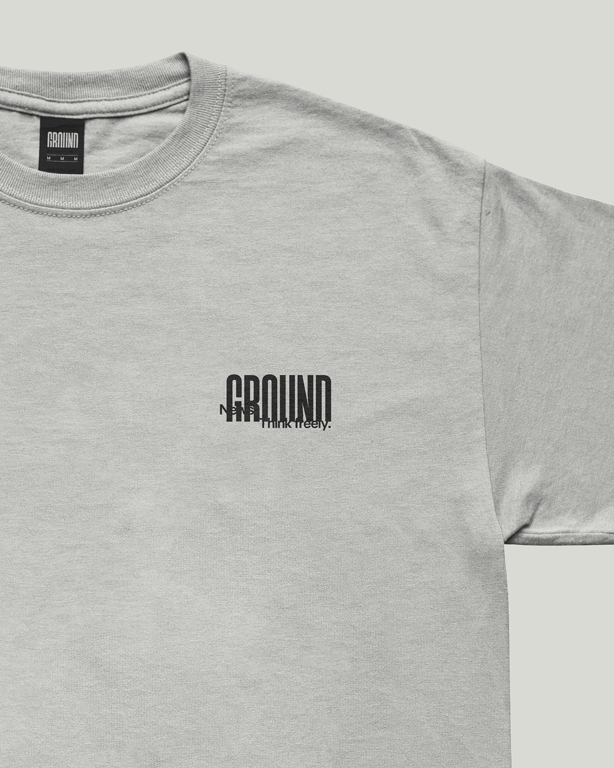
Sensationalist newspaper headlines were the major inspiration behind Ground's new wordmark. The notion that these bold, ultra-condensed typefaces function to draw in and make an impact on readers resonated with the team as Ground's mission is one in the same. Using references from archived newspaper headlines and modern type foundries alike, we crafted a low-contrast, bold, ultra-condensed wordmark that reflects the distinct characterisitics of news' printed past, while still feeling bespoke and ownable in the digital news space. Then we took our bespoke type and cut the bottom off, rooting it in negative space to reinforce the brand name in a literal state of groundedness. This can also be seen as a metaphorical representation of the end-state of our reader's civic literacy journey. Grounded.
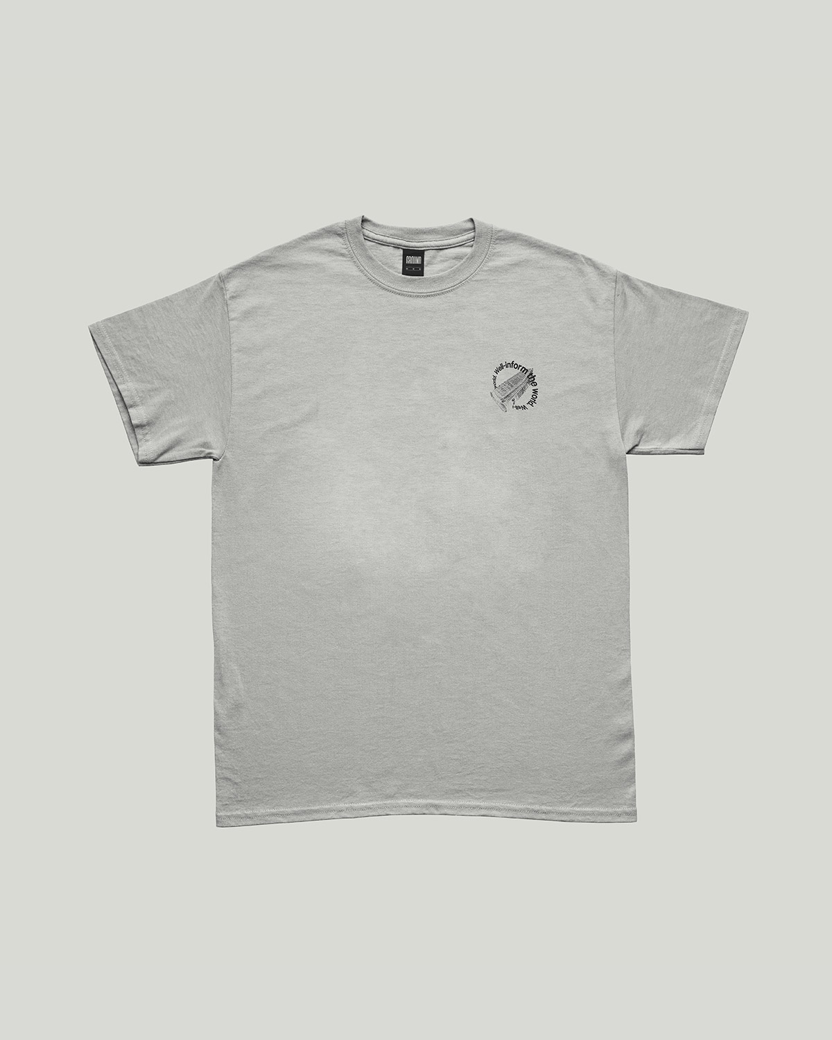
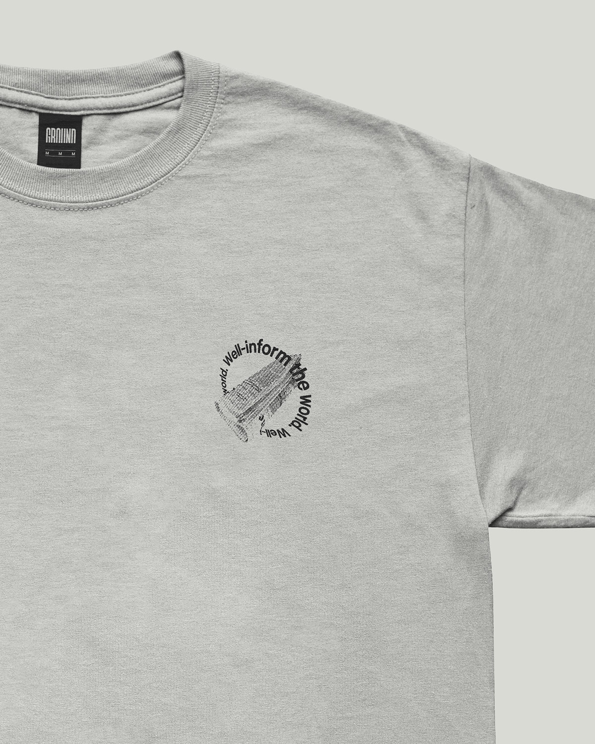
The Color
The political meaning tied to color makes owning a specific color palette complicated for a global neutral brand. e.g. Red equals conservative in the States, but everywhere else in the world it symbolizes left-wing ideologies. To be truly impartial, we felt it imperative to own black and white for our primary palette. We leaned into the soft washed out blacks and off-whites of ink on newsprint for a unique digital look and to soften the digital reading experience. The secondary palette, used primarily in product, was created to clearly indicate not just bias but its spectrum. Lastly, the tertiary palette was developed for various UI elements in both dark and light reading modes. Together, this new palette created an easily understood taxonomy of brand vs. political bias colors.
The Photography
Staging, photo retouching, and cropping context can all be used as manipulation tactics to further push political agendas. To combat this, we use photography that captures a moment in history in it’s realest state, from those who were there, on the ground. It should never be staged, and absolutely never stock. To double down further on news' printed past, we developed a halftone treatment for all branding and marketing related photography complete with a custom Photoshop Action and guide for team members.
The Type
As a digital editorial experience first, Ground's typographic system needed to prioritize legibility, readability, and functionality. Enter Universal Sans as our workhorse font because of its universality and neutral look and feel.
The Digital Product
Given that Ground had already amassed a notable user base since their initial launch in 2017, it was important not to alienate that readership with the redesign, but create something fresh and new to attract a larger segment of readers while improving the overall user experience.
At it's core, Ground is a tool and guide for transparent news consumption by the masses. This distinction drew us to the utilitarian design language of schematics, diagrams, and service manuals for their ability to represent complex information in a simplified way. Referencing these intuitive systems, coupled with the minimalist palette and pared back black and white photo treatment from the brand exploration, resulted in a clean, clear, and notably unique digital editorial experience.
*Check out our Product Design Lead, Chris Ralston's portfolio for more detail on the design system and digital product updates*


NEXT